If you’ve grown up anywhere in rural Britain, particularly the Highlands and Islands, you’ll be well familiar with passing place signs on single track roads. They are, I think, one of the most iconic features of Scottish roads.
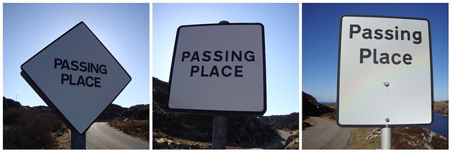
Growing up in the Uists, they were of course everywhere. Judging a passing so you and an oncoming car stop for the minimum time possible (if at all) is quite an art. This challenge – plus other obstacles such as sheep on the road – more than balance out there not being any traffic lights or roundabouts in the driving test. I remembered they all looked like the one on the left – a square sat on one of its corners, with “PASSING PLACE” written across it.
Then some years ago, mysteriously, they started to appear flat on their sides, like the one in the middle. Was this some change in the rules, or was it some monumental cock-up where someone in local government procurement accidentally ordered several thousand misprinted signs and the decision was taken to just go with them?
This past weekend’s camping trip saw us undertake a two-hour circular walk past the old mill at Altan Na Bradhan and back to the Clachtoll campsite along the coast. The first stretch was along the windy, twisty road out of Clachtoll that was of course punctuated with passing places.
The signs along that stretch included the original version (left), the newer ones (centre) and the bizarre mutation that is the one on the right. I’d never seen those rectangular ones before, and they were clearly something that could only count as a deviation from the norm.
A cursory check online throws up this webpage that details the nature of single track roads, while this thread on a forum confirms that the middle one was indeed a change. As one poster dryly notes,
bureaucrats changed the design because diamond shaped signs are reserved for instructions to tram drivers. The Highlands are of course noted for the number of recently constructed tramlines where this could have caused confusion
Perhaps we need a revolution – a campaign to bring back the corner-based passing place sign and put a definite stop to abhorences like the sign on the right above.
Who’s with me?
More posts from the trip here. Photos from the rest of the trip are here.


I know there are “more important” things to get het up about, but I really care that the passing place signs now look pretty dull and awkward! As a diamond it is far better looking,(and surely fewer exposed corners to catch the wind?!). I too thought they must have misprinted a load of signs and then just put them up anyway.
Stupid road sign people: no sense of aesthetic!
If there are more important things to get het up about than passing place signs, Julie, I’ve yet to hear about them.